Blog
Categories:
- Blog
- Kitchen Cabinet Refacing
- Kitchen Cabinets
- Kitchen Organization
- Kitchen Remodeling
- Kitchen Styles
- Kitchen Tips
- Press Release
Archives:
CHECK OUT OUR NEW PROJECT IN Furlong, PA
When it comes to kitchen renovations, striking the right balance between modern design and practical functionality can be a challenge. Recently, we embarked on a project that exemplified this blend beautifully. Our customer envisioned a space that embraced new technologies while maintaining a classic aesthetic. They wanted to replace their existing double oven with a state-of-the-art Bluetooth-controlled microwave/oven combo, add a new 36” freestanding range, and create more storage—all without embarking on a complete kitchen overhaul.

A Fresh Vision
The journey began with the removal of the dark cherry cabinets that previously dominated the space. The goal was to incorporate a custom color white that the customer had in mind, creating a lighter, more inviting atmosphere. This decision set the tone for a fresh and functional kitchen design.
Smart Layout Adjustments
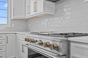
One of the key modifications involved removing the 36” standard cooktop base cabinet to accommodate the new gas range. This required relocating both the gas line and electrical connections, which are clearly reflected in the updated layout. Such adjustments ensured that the new appliances would fit seamlessly into the design.
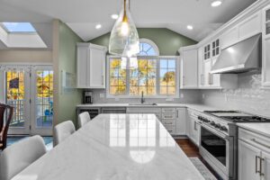
While the customer initially desired a freestanding hood, the structural constraints of the home made this impractical. Instead, we opted for a chef-style hood, creating a dedicated area for ducting. To enhance the overall aesthetic and conceal the venting, we added a decorative wainscot panel, blending practicality with visual appeal.
Enhancing Functionality
A major part of the design was creating a beverage center to enhance functionality. By removing a 24” deep cabinet and filler, we crafted a space that allowed for a beverage center, elevating both the usability and aesthetic of the kitchen.
Aesthetic Choices That Shine
The design choices made in this renovation reflect a deep consideration of character and style. For the backsplash, the customer wanted something with personality—steering clear of the ubiquitous white subway tile. We selected a wavy tile in a 3” x 12” size, providing a handmade look that adds texture and uniqueness to the space.
The island stands out with custom wainscot panels finished in a rich walnut stain, beautifully accented by brushed gold hardware. It’s not just about looks; the island also features a double trash rollout for convenient waste management, marrying functionality with elegance.

Attention to Detail
Throughout the kitchen, thoughtful design elements contribute to the overall ambiance. The stunning custom quartz countertops not only enhance the visual appeal but also demonstrate a commitment to practicality. The large stainless steel sink, complete with all necessary accessories, ensures that functionality is never compromised.
The hard maple doors, finished in a custom Sherwin Williams color and accented with brushed gold hardware, add a refined touch. These cabinets, flanking the hood, feature 4-lite glass doors that invite a sense of elegance while allowing for display lighting to showcase cherished items.
Storage Solutions
Addressing storage needs was crucial in this renovation. The original kitchen had a basic fridge alongside wall cabinets that did not maximize space effectively. We integrated the new refrigerator for a streamlined look by adding a 3-inch filler and creating a custom pantry with pull-out drawers, all enhanced with full-length wainscot panels.
The Result
This kitchen transformation is a perfect example of how thoughtful design and careful planning can create a space that is both functional and visually stunning. The final product is not just a kitchen; it’s a reflection of the customer’s vision brought to life.
In conclusion, this project highlights the importance of blending modern appliances with timeless design elements to create a space that is both usable and beautiful. Whether you’re planning a kitchen renovation or just dreaming about your ideal space, remember that with the right approach, you can achieve a kitchen that truly reflects your style and meets your needs.

